The underlying objective Funding Innovation Network (FIN) is to improve the startup investing experience for both founders and investors.
As the product lead, I served primarily as UX Designer while also providing adhoc web development data science services to this FinTech startup. I brought together a multi-disciplinary team of designers, developers and data scientists to explore potential opportunities around a data-centric investment startup community platform. Primarily, I helped the company founders through a series of cycles of market validation with an MVP, User Research with a dozen customer interviews, and User Design iterations and User Testing. The final result was a complete strategic plan, a product development roadmap, and a high fidelity clickable prototypes.
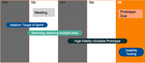
Here is an example of a design cycle:

With FIN, we hypothesized that there was space to improve this experience for both founders and investors. We found more direction in what problem space to focus on specifically through user interviews. In short, founders find it incredibly difficult to find funding unless you have a wealthy network. On the other hand, more and more small scale investors are looking for investing small percentages of their portfolio in high risk early stage companies. We hope to possibly utilize the data collected on the platform to create funding prediction intelligence down the road.
We spoke with 10 users, 5 from our founder target audience and 5 from our investor target audience. We focused on general non-leading questions to see if users would offer problems that they face. We did multiple virtual brainstorming and ideation sessions to documenting assumptions and explore customer insights from the interviews.
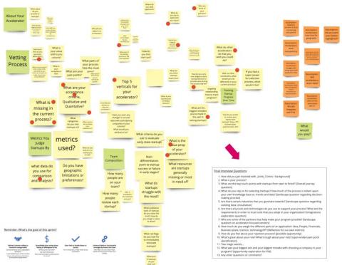
Here is an example of whiteboarding synthesis around investor needs:

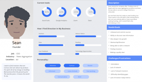
Finally, we delivered two detailed reports for each side of our marketplace business and product, namely investors and founders, and created detailed and actionable user profiles

Following a month of user research (interviews and ideation) and a month with UX design iterations, we created a complete clickable prototype in Figma that we tested with several rounds of users. We subsequently did two short data analysis projects using Crunchbase data to explore data-centric product features and layout a machine learning strategy.
Based on a three month cycle we delivered a complete business strategy, designed product and a feature requirements doc.
My Activities and Misc Deliverables:
- User Interviews: We sought out and spoke to our target users in order to understand our target problem space. We submitted reports for each persona with transcipts as well as highlighted quotes, themes, and mapping against assumptions. The outcome of these interviews were: personas, empathy maps, a report, and user stories.
- Personas: The personas evolved around ongoing interviews, research, and even prototype testings. Having a persona helped us drive product decisions based on the needs of the user rather than the intuition of the top stakeholder.
- Empathy Maps: Understanding our users environment can help understand where our product ultimately fits in with the lives of our target users. We took key quotes to infer a broader picture of their experience in the startup space.
- Designing Solutions: With a defined problem space, clear ideas from the users, and agreement on direction, we began designing the experience. The main problem space is described in the quote below. We aim to only build features that solve real user problems and validate all design decisions with user testing.
- Wireframing: We strategized a theme framework that allowed our designers to create beautifully accessible templates, while baking in enough flexibility to allow merchants to customize the experience for their industry. Site Builder extends the administrative experience, separating content into blocks and allowing for a custom but controlled end product.
- Final Prototype: Due to NDA, I am not able to share specific designs. This product is in the stage of being coded and will be hitting market at the end of this year. My work involved bringing then design from low fidelity to high fidelity, exploring various features during sprint cycles, and validating usability with user tests.
- Usability Testing: We conducted usability tests following each design sprint.
- Comprehensive Developer-Centric Product Feature List and Feature Requirements Doc with User Stories and screenshots.
